

LandMatch
A streamlined experience for discovering and evaluating land opportunities
LandMatch is a client project focused on creating a clearer and more approachable experience for users exploring land opportunities. The project centered on developing a cohesive brand identity and translating that vision into a polished digital experience.
BACKGROUND
MY ROLE
As the UX/UI Designer, I focused on developing the visual identity and digital experience for LandMatch. I created the brand direction, logo design, design system, and interface design to establish a cohesive experience that balanced visual storytelling with usability.
SCOPE
Brand Strategy, Logo design, Visual Design, UI Design, Design System, Prototyping
TOOLS
Figma, FigJam, Claude Design
LandMatch focused on developing a cohesive brand identity and digital experience for a platform centered around land discovery. the project explored how visual design, branding, and UI systems can work together to create a more approachable and trustworthy user experience.
PROBLEM
The process of exploring land opportunities can feel complex due to unclear information, inconsistent presentation, and limited visual guidance. The challenge was to create a brand and digital experience that felt trustworthy, approachable, and easy for users to navigate.
GOAL
Create a cohesive brand identity and digital experience that builds trust, improves clarity, and helps users confidently explore land opportunities.
UNDERSTANDING THE USER
Research and competitive analysis explored user behaviors, needs, and expectations when evaluating land opportunities. findings helped inform the brand direction, visual hierarchy, and overall experience by identifying opportunities to create a more trustworthy, approachable, and intuitive platform.
KEY INSIGHTS
Users need clarity when exploring land opportunities
Complex information and inconsistent presentation can make it difficult for users to understand available options and make confident decisions.
Thoughtful typography, visual hierarchy, and consistent design patterns help simplify information and create a more intuitive experience
A strong brand system can improve usability
Trust is essential when evaluating potential opportunities
A cohesive visual identity and clear communication help establish credibility and create a more approachable experience.
BUILDING THE DESIGN SYSTEM
The branding process focused on creating an identity that communicated trust, clarity, and approachability. Logo exploration, typography, color, and visual elements were developed to establish a recognizable brand foundation and define the overall design direction.
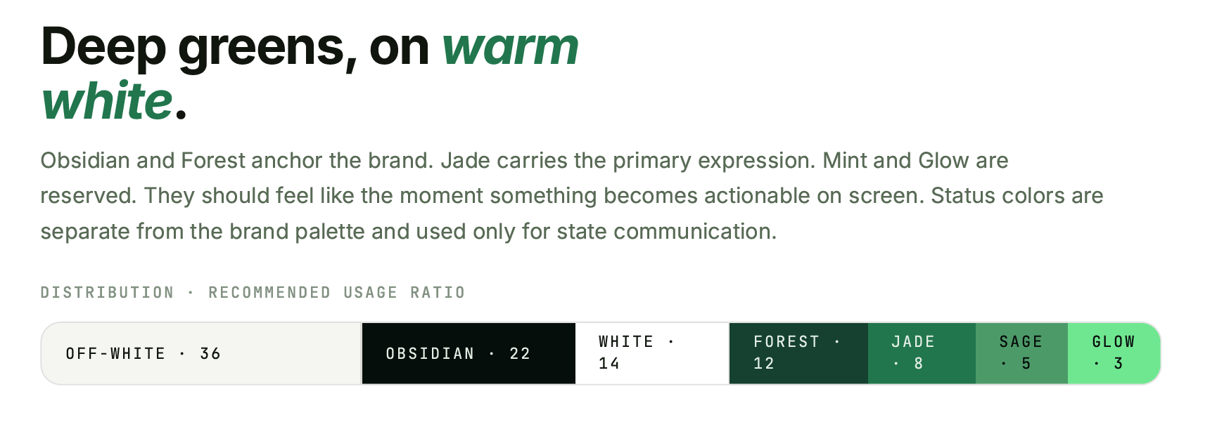
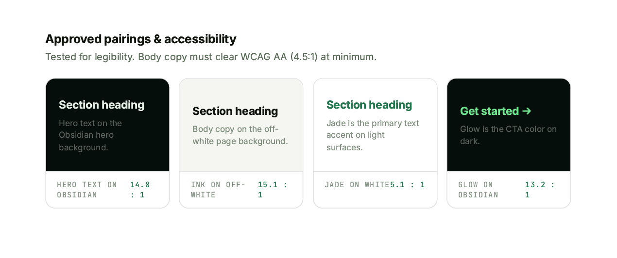
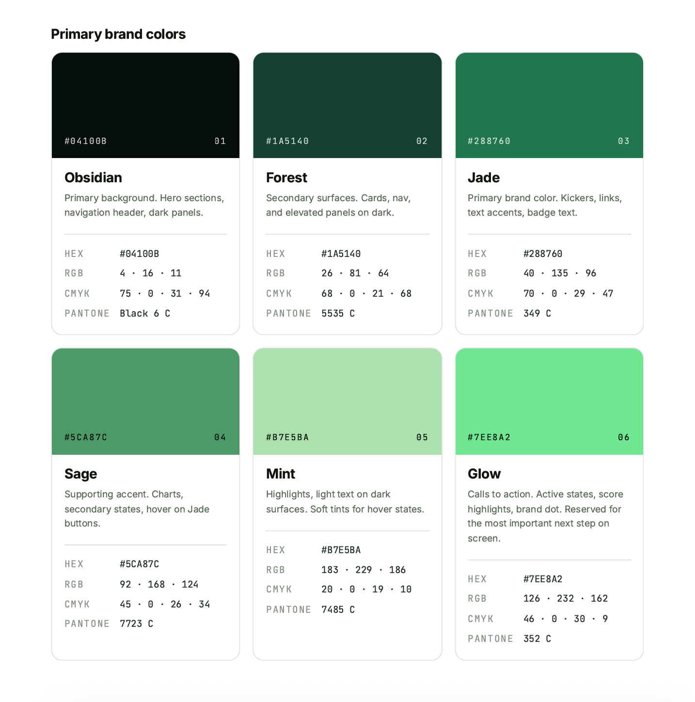
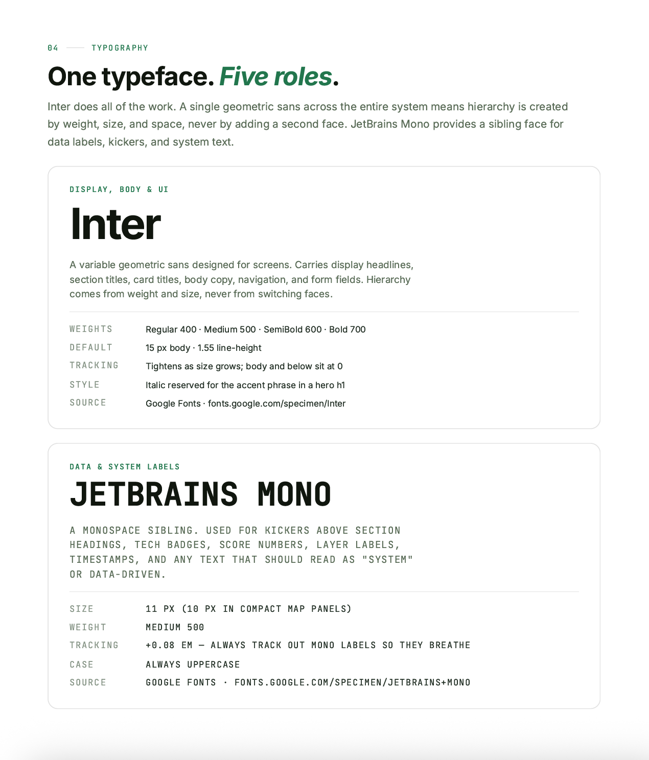
BRAND STRATEGY & VISUAL DIRECTION
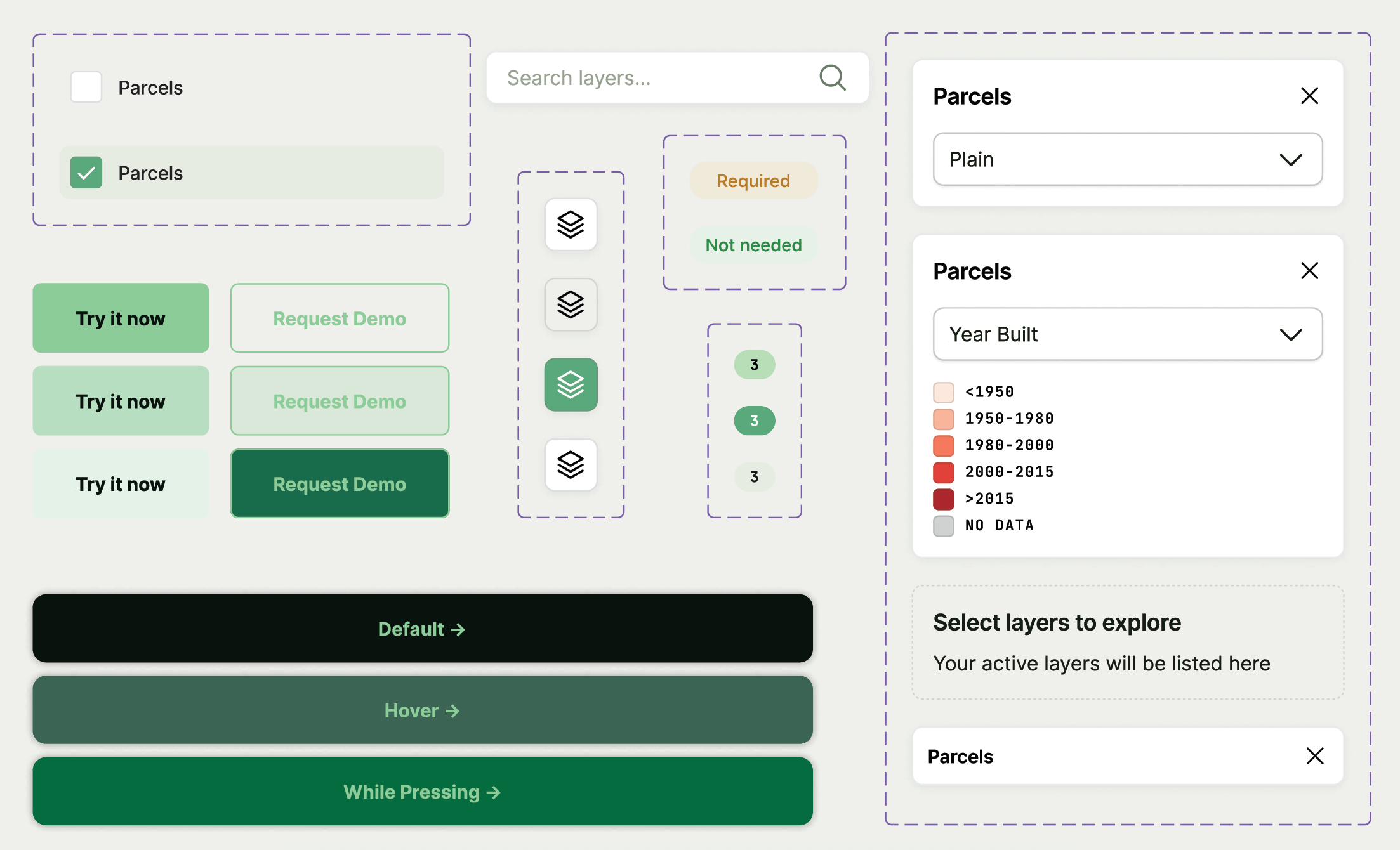
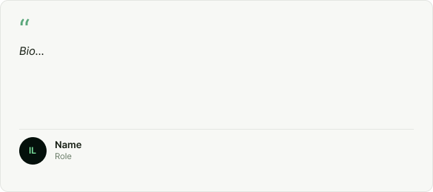
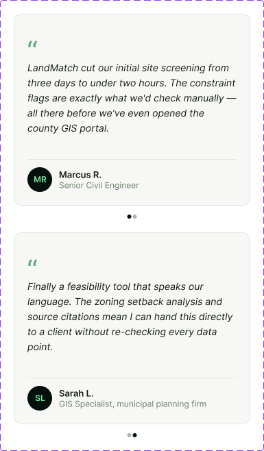
The visual identity was translated into a digital design system that established consistency across the interface. Components, UI patterns, visual guidelines were created to support a cohesive product experience while maintaining the LandMatch brand personality.



FINAL DESIGN
The final interface brings together the LandMatch brand identity and digital experience through a cohesive visual system. The design balances approachable branding with clear interface patterns, creating a platform that feels trustworthy, intuitive, and easy to navigate.
LandMatch reinforced the importance of creating digital experiences where branding and usability work together. By developing a strong visual foundation and translating it into a cohesive interface, the project transformed a complex process into a clearer and more engaging user experience.